Weekly Notes
Geospatial Development
FOSS4G (UK)
The global FOSS4G conference ended last Friday and my twitter feed was full of it. Very interesting things, need to watch a few of those videos. I’m sad that I missed the global version of the conference this year. But I attended the North American version earlier this year, will attend the UK version later this month and likely head down to New Zealand for the Oceania version.
Mercator, again

A fun old Illustration I dug up from a 9 year old blog post about how straight lines look in Mercator. (From John Nelson)
https://twitter.com/John_M_Nelson/status/1165967275209478144
Wildfires

A nice transition from just raw data to heat map and later to insight. (Thanks Josh for the nice summary 😁 )
https://twitter.com/wallacetim/status/1166123435224776704
Data Visualization
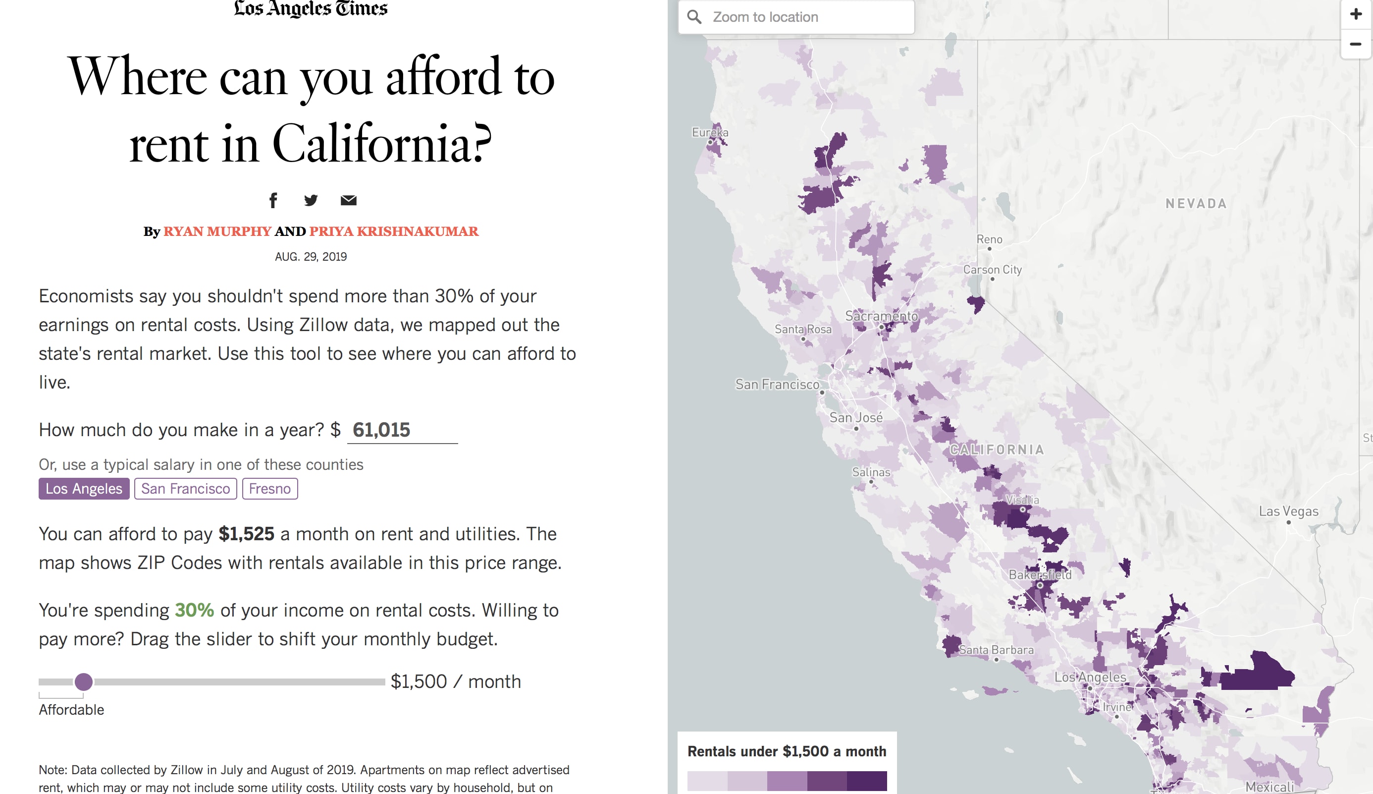
Where can you afford to rent in California?

Nice interactive tool where you can put your salary and see where you could afford to live in California. For my upcoming course Geospatial data visualization with d3 I’m using housing data for Chicago to map in a similar fashion. But I’m using neighborhoods as a measurement (because the data is provided in that format for the most part.)
https://www.latimes.com/projects/california-rental-calculator-map/
We’re at the peak of the global fire season
Great usage of satellite data and pretty interesting color scale choice. Worth exploring more.
https://www.washingtonpost.com/climate-environment/2019/08/30/were-peak-global-fire-season/
Short-term rentals in Toronto: UPGo city spotlight
The great thing about this report is not the small multiples (although I ❤️ small multiples). But rather that they published all their results on Github to be reproduced. Although the data is not available on GitHub just their analysis code.
https://upgo.lab.mcgill.ca/2019/08/23/short-term-rentals-in-toronto-report/
[A night under the stars]

A look at overnight stays at US National Parks
When should you pitch your tent? Or when is it better to opt for lodging? When should you visit to avoid the crowds? Let’s have a look!
Did I mention that I ❤️ small multiples? This is a gorgeous example.
And the first section is an explanation of how the charts work and how to read it. It’s always recommended to include such a section if you have a novel way or choose a not standard way of showing data.
As Rising Heat Bakes U.S. Cities, The Poor Often Feel It Most
Another great collection of small multiples. Overall this project is great. I love the usage of satellite data to get the temperatures and tailor it to your audience since you can select your won city. It’s a novel approach to look at temperature and income at the same time. And they have their process documented and the code uploaded to GitHub. Thanks a lot!
Here’s Who Owns the Most Land in America
I love the annotations and storytelling part. You can click on the dots on the right side and it will showcase different owners and the map will center on the region of these properties. Well done!
https://www.bloomberg.com/graphics/2019-largest-landowners-in-us/
‘Off-the-charts’ heat to affect millions in U.S. in coming decades
Using a circle to showcase number of dangerous days is an interesting approach. Especially interesting is the way the annotation works. They used Seattle for a lengthier explanation of the number underneath the city name because they had enough space to add it.
Color Tool
The great thing is the immediate feedback in a chart and a map. Although I would have used another chart than a pie.
https://learnui.design/tools/data-color-picker.html#palette
Civic Tech
Civic Tech projects in Canada
The team at @opennorth is collecting examples of #civictech projects in Canada, and will be submitting them to the @civictechguide!
If you’re working on a project (or have worked on one) take a minute and add it to their list.
https://twitter.com/code4ca/status/1169334327978672128
Explore the NYC Capital Commitment Plan
New civic tech project from Chris Whong exploring capital spending in NYC.
https://capital-commitments.chriswhong.com/fy19
Scooter startup says needy communities in San Francisco asked to be excluded
This is an interesting set of articles from the LA Times. The first article was titled “Scooter startup says needy communities in San Francisco asked to be excluded” and after the article was published Scoot responded that the commented asked to be excluded. We need to be careful how we use the data from scooter companies. My question to the LA Times would be, did not sent the article to Scoot before publishing it?
https://www.latimes.com/business/technology/story/2019-08-16/scoot-defends-redlining-narrow-sidewalks
https://www.latimes.com/business/technology/story/2019-08-14/san-francisco-scoot-tenderloin-bird
Photo of the Week


