Weekly Notes
Welcome to this new edition of my newsletter. I hope you all had a great week. I certainly had one.
Tools & Frameworks for Mapping Data
After a discussion on twitter and a question I saw in a facebook group about what Tools are out there to create maps, I thought I create a list of all the tools and Frameworks I could find.
I created a new airtable and integrated it here. I also included the Tool/Framework is free to use or only paid.
If you find a tool or framework that I missed, please let me know, and I will add it to the list.
(Geospatial) Data Visualization
Another great week of geospatial data visualizations.
What Micro-Mapping a City’s Density Reveals
An interesting new look at density using satellite imagery and a different measure of density. By looking at a regular pattern of equally sized cells of one square kilometer you get a different perspective of cities.
This perspective lets us drill down to the micro-geography of density in American cities, with oftentimes surprising results, as in the densest grid cell of greater Salt Lake City (below), which isn’t high-rises but mobile home parks.
This is a fascinating observation. I would have not guessed that a mobile home park would be more dense than a high-rise area.
Just as average wealth and income statistics can’t take us very far in explaining how to fairly structure the distribution of economic gain in our society, the average population density of a vast metropolitan area does little to capture the many different ways that we might want to structure our cities and neighborhoods.
The whole article is well worth a read and the visualization is nice to play with.
https://www.citylab.com/perspective/2019/07/urban-density-map-city-population-data-geography/591760/
Subway Commute NYC
Nice visualization from the New York Times about your subway commute in New York. I always love transportation visualizations. You can do so much with these datasets.
The data is Open Data from the M.T.A.
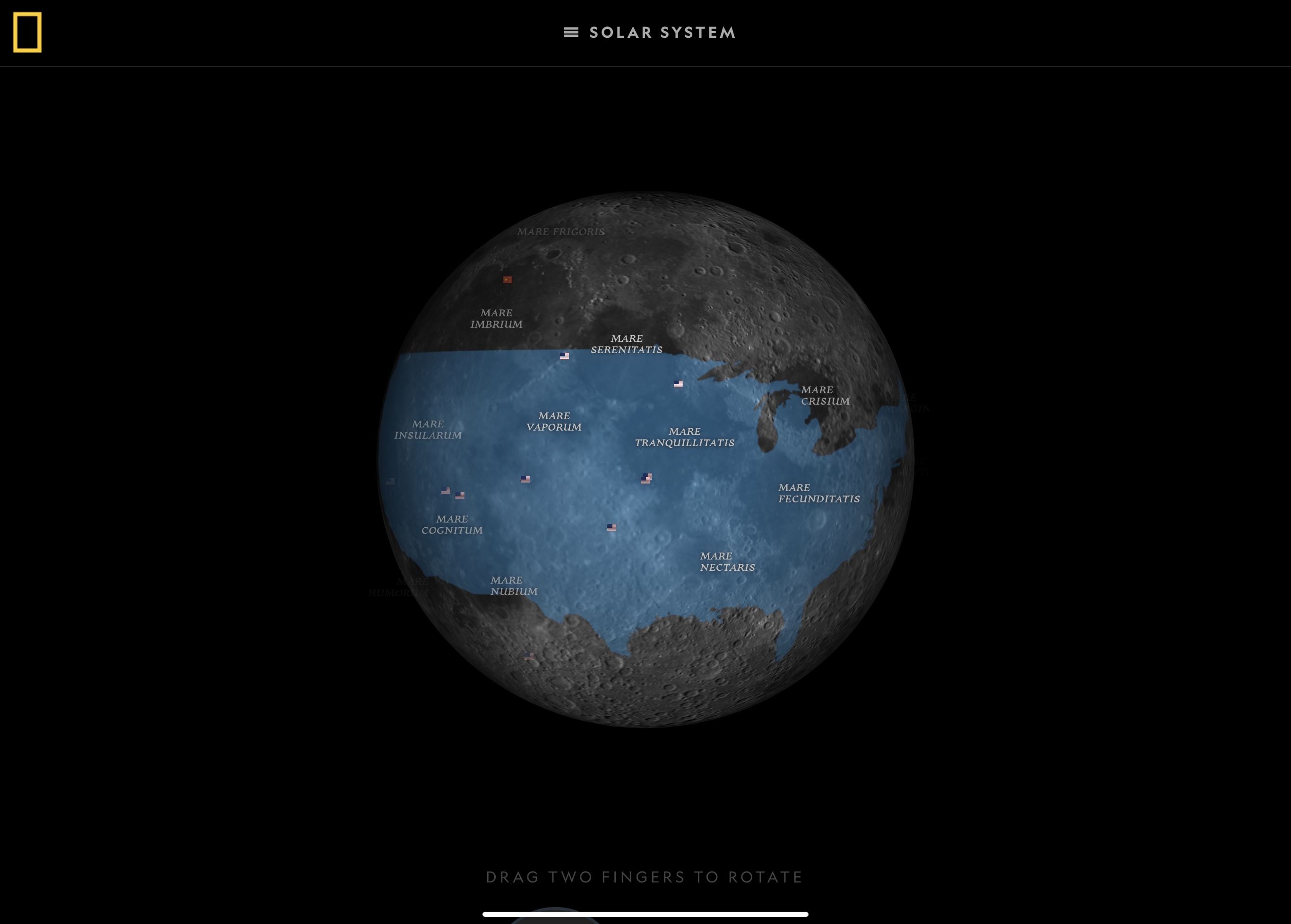
Atlas of the Moon
Stunning visuals from the moons of the galaxy. I especially like the feature where you overlay known countries or regions to get a sense of the scale.
https://www.nationalgeographic.com/science/2019/07/the-atlas-of-moons/
New Tool: TheyDrawIt!: An Authoring Tool for Belief-Driven Visualization
Geat research by the Midwest Uncertainty (MU) Collective from Jessica Hullman (Northwestern) & Matthew Kay (UMichigan). The tool looks very promising. Still in the early phases and only works with linecharts and only GoogleSheets, but still good progress. Would love to see more research into data viz recall.
We found that when users had the ability to draw their expectations and see them against the observed data, they recalled the data 20–25% more accurately a short time later.
Homeless and Urban Planning San Diego
The San Diego Data Library from Eric Busbom with Data Science for Non-Profits is starting a series of meetings exploring homelessness and urban planning. With Open Data datasets and data visualization they’re going to look at the homeless population in San Diego.
Data Visualization for Audiences in Low & Middle-Income Countries
The Data Visualization Society is a great place to hang out and get a better sense of what‘s happening worldwide in the data visualization sector. The Medium posts summarize discussions that happen inside the Slack room. This one is very important for anyone doing data viz in Low & Middle-Income countries.
With limited time to digest data, it becomes extremely important to use data visualization as an effective, memorable communication tool.
What Are Data Visualization Style Guidelines?
Another great article from the Society.
https://medium.com/data-visualization-society/style-guidelines-92ebe166addc
Civic Tech/Open Data
Open Source procurement law in German state
The parliament in a German state has a new procurement law where Open Source solutions shall be given preference if it’s technically possible and economically feasable. Whatever that means :) Law (if you can read Germany)
The Scooters Are Coming: let’s require data this time
I agree with Andrew that these scooters are very convenient and I wrote about the scooters in Berlin last week. He makes great points, that cities should and probably must require data as part of the regulatory environment and should release them as Open Data.
Go check out that article:
https://www.azavea.com/blog/2019/07/10/the-scooters-are-coming/
The limits of civic tech: Learning from kleineAnfragen
Great article from Tori about the civic tech project kleineAnfragen and lack of government technology and funding in general in Germany.
the status quo whereby the civic tech scene is responsible for a huge portion of the work being done for a more transparent and open digital future while only being supported by short-term grants of money (if funded at all) is not sustainable. Governments need to do more, and they need to do better.
https://toridykes.com/blog/2019/6/24/kleine-anfragen
Business/Consulting
I‘m currently in video production mode for my upcoming course „Geospatial Data Visualization with d3“. Currently producing more entry-level material that will be released for free soon. If you want to get more info head over to mappingwithd3.com and sign up.
Tip of the week
Get out, enjoy the sun. Go to a café work in a different environment. It will improve your productivity.
Photo of the Week


